You have been lied to by every classroom map you ever trusted.
It’s not the teacher’s fault. It’s not Google’s fault. It’s not even the cartographer’s fault. It is the cold, hard, unbreakable law of geometry.
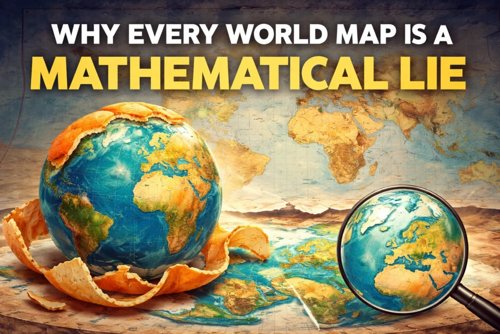
Here is the truth: You cannot flatten an orange peel without ripping it.
Let that sink in. Go grab an orange from your kitchen. Peel it carefully in one long spiral. Now, try to smash that curved, bumpy peel flat on your kitchen table. What happens? It cracks. It tears. It stretches in some places and bunches up in others.
That orange is planet Earth. And every single map you have ever seen is that torn, stretched, and cracked peel.
Welcome to the beautiful, frustrating, and mathematically wild world of cartography. Today, we are going to pull back the curtain on the Mercator projection, the sneaky villain of geography, and discover why your brain has been visualizing the world wrong for your entire life. We are going to take a very long, very detailed walk through the history, the math, the politics, and the psychology of maps. By the time you finish reading, you will never look at a world map the same way again.
H2: 1. The Innocent Map in Your Classroom That Started the Lie
Think back to elementary school. Hanging above the blackboard, right next to the periodic table and a faded poster of the solar system, was a big rectangular map. It had bright colors. Blue for the ocean, green for the plains, brown for the mountains. Greenland sat up near the top like a giant white hat. Africa stretched down the middle like a proud, wide torso. Antarctica was squished along the bottom like a long white snake that had been stepped on.
You probably pointed at that map and thought, Wow, Greenland is massive.
You were wrong. Not a little wrong. Comically wrong. Embarrassingly wrong.
That map was almost certainly the Mercator projection, created way back in 1569 by a Flemish guy named Gerardus Mercator. He wasn’t trying to lie to you. He wasn’t trying to make Europe look powerful. He was trying to help sailors not die.
Let me explain. Back in the 1500s, sailing was terrifying. You had a wooden ship, a compass, and a prayer. If you wanted to sail from Spain to the Caribbean, you needed a map where a straight line represented a constant compass bearing. That means if you drew a line on the map, you could follow that exact same angle the whole way without constantly recalculating.
Mercator solved that problem. He made a map where lines of latitude and longitude cross at perfect, neat right angles. It looked like a grid. It worked like a dream for boats. Sailors loved him. He became famous.
But here is the devil’s bargain: To keep those lines perfectly straight, Mercator had to stretch the poles. Imagine wrapping a cylinder of paper around the Earth. You trace the globe onto the cylinder, like rubbing a crayon over a coin under a piece of paper. Then you unroll the cylinder. At the equator, everything looks fine. The cylinder touches the Earth there, so no stretching happens.
But as you move north or south toward the poles, the cylinder is no longer touching the Earth. It is floating in space around the planet. To connect the globe to the cylinder, you have to pull the map wider and wider. You have to stretch the landmasses sideways like taffy. By the time you reach the Arctic, things are blown up to monstrous, ridiculous sizes.
That is why on your classroom map, Greenland, which is 2.1 million square kilometers, looks the same size as Africa, which is 30 million square kilometers. Africa is 14 times larger than Greenland in real life. Fourteen times. You could fit fourteen Greenlands inside Africa. But on the Mercator map, they look like neighbors. Best friends. Equals.
They are not equals.
Let me give you another mind-bender. On the Mercator map, Greenland looks bigger than China. China is 9.6 million square kilometers. That means China is roughly four and a half Greenlands. But look at the map. You wouldn’t know it. Your eyes tell you Greenland is the boss of the north. Your eyes are liars.
And it gets worse. Scandinavia looks enormous. Sweden, Norway, and Denmark together look like they could swallow Germany whole. In reality, India is bigger than all of Scandinavia. But India sits near the equator, so on the Mercator map, it looks like a modest little wedge hanging off Asia.
The technical term for this is area distortion. The human term for this is a massive headache.
H2: 2. The Greenland Paradox: A Chilling Mathematical Illusion
Let’s play a mental game. Close your eyes. Picture Greenland. White. Icy. Lonely. Now picture India. Hot. Crowded. Green and brown.
On most digital maps, which still use a modified Mercator, Greenland looks like a gigantic icy monster swallowing the North Atlantic. India looks like a small, shy triangle.
Now, here is the shocker: India is bigger than Greenland.
I know. It hurts your brain. It hurts my brain, and I write about this stuff. India is roughly 3.2 million square kilometers. Greenland is 2.1 million. India could swallow Greenland and still have room for dessert. For a side dish. For a second helping.
But wait. It gets even more painful.
On the Mercator map, Alaska looks almost as big as the entire lower 48 United States. That is absurd. Alaska is big, yes. You could fit Texas into Alaska twice. But the lower 48 states are roughly 8 million square kilometers. Alaska is 1.7 million. Alaska is about one fifth of the lower 48. But on the map? They look like twins.
Why does this happen? Because Greenland, Alaska, Scandinavia, Canada, and Russia are all very close to the North Pole. Remember the cylinder from the last section? The closer you are to the top of the cylinder, the more the map has to stretch sideways to cover the curve of the sphere. Mercator literally inflates high-latitude countries like balloons.
Let me give you a specific number. On a Mercator map, a country at 60 degrees north latitude, which is where Oslo, Norway, and Anchorage, Alaska, sit, is stretched to twice its real width. A country at 75 degrees north, which is northern Greenland, is stretched nearly four times. By the time you get to 85 degrees, the stretch is almost ten times.
Ten times! That means a small island near the North Pole looks ten times wider than it actually is. No wonder our brains are confused.
And it is not just width. It is area. When you stretch width, you also stretch height to keep the shapes looking normal. So the area gets multiplied. A small patch of land near the pole can look like a continent.
This is why Russia looks like it takes up half the planet on a Mercator map. In reality, Africa could fit nearly two Russias inside it. Africa is 30 million square kilometers. Russia is 17 million. Africa is almost double Russia. But look at a Mercator map. Russia stretches from Europe all the way to Alaska. It looks endless. Africa looks cute.
Here is a fun party trick. Next time you are at a friend’s house and they have a globe, point to Greenland. Then point to Australia. On a Mercator map, Australia looks smaller than Greenland. On a globe, Australia is more than three times larger than Greenland. Australia is 7.7 million square kilometers. Greenland is 2.1 million. Australia wins by a landslide.
But you would never know it from a flat map. That is the power of the mathematical lie.
H2: 3. The Tear in the Fabric of Reality: Why Spheres Hate Rectangles
Now we need to get a little bit mathematical. But do not close the tab. I promise you can understand this. It is actually beautiful.
There is a famous idea called Theorema Egregium. That is Latin for Remarkable Theorem. A German mathematician named Carl Friedrich Gauss figured this out in 1828. He was one of the smartest humans who ever lived. They called him the Prince of Mathematicians.
Gauss proved something wild. He proved that a curved surface, like a sphere or an orange, has a different type of geometry than a flat surface, like a piece of paper or your phone screen. They are not just different shapes. They are different realities.
Let me show you what I mean.
On a flat piece of paper, if you draw a triangle, the three inside angles always add up to 180 degrees. Exactly. Always. That is flat geometry. It is predictable. It is boring.
Now take a sphere. Draw a triangle on a ball. Start at the equator. Draw a line straight north to the North Pole. Then turn 90 degrees right. Draw a line straight south back down to the equator. Then turn 90 degrees right again. Draw a line along the equator back to your starting point.
Look at the triangle you just made. You have three corners. And here is the shock: Each corner is 90 degrees. The total is 270 degrees. That is 90 degrees more than a flat triangle.
A triangle on a sphere is different from a triangle on a flat table. They obey different laws. They live in different universes.
This is why you cannot flatten a sphere without changing something. The sphere has curvature. The flat paper has no curvature. You cannot force one to become the other without cutting, stretching, or tearing.
Cartographers call these the three sacred things that every map wants to keep honest:
Number one: Area. How big a country is compared to other countries.
Number two: Shape. What a country looks like. Is it round? Is it long? Is it squiggly?
Number three: Distance. How far apart two cities are. Is it 500 miles or 5,000?
Here is the brutal truth. You can only keep two of these three things honest at the same time. The third one has to become a lie. There is no map in existence that keeps all three. It is mathematically impossible. Gauss proved it two hundred years ago.
So every mapmaker has to choose. Which lie do you prefer?
Mercator chose to keep Shape and Direction. He said, I want sailors to have straight lines and accurate angles. I don’t care if Greenland looks like a monster. He destroyed Area.
Other maps choose to keep Area and Distance. But then they destroy Shape. Countries look stretched or squished like funhouse mirrors.
Other maps choose to keep Area and Shape in small regions. But then they destroy Distance. Suddenly the flight from London to Tokyo looks like it goes through the moon.
No map wins. Every map is a compromise. Every map is a beautiful, intentional, mathematically necessary lie.
And here is the kicker. Even a globe is not perfect for everything. A globe is perfect for shape, area, and distance. But a globe is terrible for seeing the whole world at once. You can only see half of it. You have to spin it. You cannot put a globe in a textbook flat on a page. So we are stuck with lies. Forever.
H2: 4. The Gall-Peters Drama: When Maps Become Political Weapons
You might think a map is just a neutral tool. A simple drawing. A helpful guide.
Oh, no. Maps are arguments. Maps are politics. Maps are weapons.
In the 1970s, a German historian named Arno Peters got very angry. He looked at the Mercator map and saw a conspiracy. He claimed that Mercator was a racist, colonialist tool. He said the map was designed to make Europe and North America look huge and powerful while shrinking Africa and South America.
Was he right? Partially. Mercator did not intend to be racist. He just wanted to help ships. But the effect was real. For four hundred years, schoolchildren in Europe and America grew up seeing their continents as giant giants and other continents as tiny little afterthoughts.
Imagine growing up in Nigeria. You look at a Mercator map. Your country, Nigeria, looks like a small, thin strip. Meanwhile, Norway, which is much smaller than Nigeria in real life, looks like a giant muscular arm. What does that do to a child’s self-esteem? What does that do to a country’s sense of importance?
Peters believed it did real damage. He believed the Mercator map made people in wealthy countries subconsciously think that poor countries were small and unimportant. He believed it affected foreign aid, military decisions, and even climate change policy.
So Peters created his own map. He did not invent it from scratch. A man named James Gall had made a similar map in 1855. But Peters marketed it like crazy. He called it the Gall-Peters projection.
What does the Gall-Peters map do? It keeps area perfectly accurate. Every country is the right size. Africa looks massive, because Africa is massive. South America looks huge, because South America is huge. Europe looks small, because Europe is small. Finally, the truth.
But here is the problem. To keep area perfect, the Gall-Peters map destroys shape. And I mean destroys it. Africa looks like a tall, stretched-out skyscraper. It is too tall and too skinny. Indonesia looks like a sad, melted sock. Europe looks like a shriveled peanut that someone left in the sun too long. Antarctica is a long, flat line across the bottom that looks nothing like a continent.
Sailors hate the Gall-Peters map. You cannot navigate with it. A straight line on a Gall-Peters map is not a constant compass bearing. You would crash into islands.
Teachers hate the Gall-Peters map. Kids laugh at the squished shapes. They say, Why does South America look like it is melting?
Mathematicians hate the Gall-Peters map because it still distorts distances. It is not a perfect map. It is just a different lie.
The moral of the story is painful but simple. You cannot fix a lie with another lie. You just choose which lie hurts less. Or which lie serves your purpose better. Mercator helps navigation. Gall-Peters helps fairness. Neither one shows the whole truth.
H2: 5. The Only Map That Does Not Lie, But You Cannot Fold It
So, is there any way to look at the Earth without being deceived? Any way at all?
Yes. But you cannot put it in a backpack. You cannot hang it on a classroom wall. You cannot fold it into a glove compartment.
It is called a globe.
A globe is the only true representation of Earth. It has no tears. No stretching. No inflation. Greenland looks properly small. Africa looks properly gigantic. The distance from New York to London is perfectly accurate. The shape of India is exactly right. The area of Brazil is honest.
A globe is the truth.
But globes are annoying. They are expensive to make. They take up a lot of space. You cannot see both sides at once. If you want to look at Australia, you have to spin the globe away from America. You lose half the world. And if you try to print a globe on a flat page, you are back to square one. You are back to the lie.
However, clever mapmakers have tried to split the difference. They have tried to make flat maps that are less wrong. One of the coolest is the Dymaxion map. It was invented by a wild, brilliant man named Buckminster Fuller. He was an architect, a philosopher, and a dreamer. He wore three watches and spoke in long, looping sentences.
Fuller’s Dymaxion map looks like a bunch of triangles stuck together. It looks like a disco ball that exploded and then someone tried to glue it back together wrong. It is not a rectangle. It is a jigsaw of continents floating in an ocean of empty white space.
Here is the magic of the Dymaxion map. It has almost no area distortion. Greenland looks small. Africa looks huge. But the shapes are not perfect. The continents are cut into pieces. You have to mentally stitch them back together. It is confusing. It is weird. But it is honest.
The most popular compromise today is the Winkel Tripel projection. You have seen it. You just did not know its name. National Geographic switched to the Winkel Tripel in 1998. Before that, they used a different projection for decades. They switched because the Winkel Tripel is the least ugly lie.
What does the Winkel Tripel look like? It looks like a squashed oval. The top and bottom are curved. The left and right are pointed. It is not a rectangle. It is not a circle. It is a weird, lumpy potato shape.
The Winkel Tripel does not keep anything perfectly. Areas are a little wrong. Shapes are a little bent. Distances are a little off. But nothing is catastrophically wrong. The errors are spread out evenly. Everything is a little bit fake, but nothing is outrageously fake.
It is like a friend who tells small, harmless lies. Greenland is a little too big, but not outrageously big. Antarctica is a little too wide, but not comically wide. It is the compromise we can all live with.
But even the Winkel Tripel is a lie. Do not forget that.
H2: 6. How Google Maps Tricks You Every Single Day
Pull out your phone right now. Open Google Maps. Zoom all the way out so you see the whole world. Notice something?
Greenland is still huge. Africa is still small-ish. Russia still looks like a monster. Canada still looks like a giant.
That means Google Maps is still using a version of Mercator. Even today. Even with all our technology. Even with all our knowledge.
Why? Why would Google, the smartest search engine on Earth, use a four-hundred-year-old map that lies about area?
Because Mercator is perfect for zooming in on your street.
Think about it. When you need driving directions, you do not care about the size of Greenland. You care about a right angle. You want the map to show you that turning left at the gas station is actually a 90-degree turn. You want the map to show you that going straight means going straight. You want local shapes to be correct.
Mercator preserves those local angles. That is called conformality. It means a tiny square on the map is a tiny square on the ground. It means the shape of your neighborhood is accurate. It means you will not drive into a lake.
If Google used the Gall-Peters map for turn-by-turn navigation, your car would tell you to turn at a 75-degree angle when the road actually bends 90 degrees. You would crash into a McDonald’s. Or a school. Or a river.
So Google made a deal with the devil. They said, We will lie about the size of Russia, but we will get you to the airport on time. We will inflate Alaska, but we will help you find the nearest coffee shop.
And honestly? Most of us are okay with that trade. We want to get where we are going. We do not want philosophical purity. We want to avoid traffic.
But here is where it gets sneaky. Your brain does not switch modes. You zoom out to see the whole world. You see the giant Arctic. You see the tiny Africa. Your subconscious files that away as truth. Even though you know it is a lie, the visual sticks.
Psychologists call this the mere exposure effect. The more you see something, the more you believe it. Even if you know it is wrong. Even if you have been told it is a lie. Your eyes win over your brain.
That is why Google Maps is dangerous. Not because it is evil. But because it is comfortable. And comfortable lies are harder to unlearn than obvious lies.
Try this experiment. Open Google Maps. Type in Greenland. Zoom out. Now type in Africa. Zoom out. See how Google presents them. See how the website does not warn you about distortion. See how it just shows you the map as if it were truth.
That is the quiet power of the mathematical lie. It does not announce itself. It just sits there, looking innocent, slowly warping your sense of the world.
H2: 7. The Human Brain Hates the Truth, Here Is Why
Let us do a quick experiment. Do not cheat. Do not look at a map. Answer honestly.
Which is farther east: the southern tip of South America, which is in Chile, or the eastern coast of the United States, which is Maine?
Most people say Maine. They picture the United States on the left side of the map. They picture South America hanging down on the right side. They think, Of course Maine is farther east. It is on the East Coast.
The truth? The southern tip of Chile is actually farther east than New York City. By a lot. By hundreds of miles.
Let me give you another one. Which is farther north: the northern tip of Canada or the southern tip of Alaska?
Most people say Canada. Because Canada is the cold north place. Alaska is just a piece of the United States.
The truth? The southern tip of Alaska is farther north than the northern tip of Canada. Not the other way around.
Why do we not know these things? Because Mercator stretches the high latitudes horizontally. It makes North America look like it spans the entire width of the ocean. It does not. It makes Canada look like it is always on top. It is not always on top.
Your brain has been trained since kindergarten to see the world through a rectangular grid. That grid is fake. It is a projection. It is a mathematical lie. And your brain has gotten so comfortable with the fake that the real truth feels wrong.
This is called cartographic conditioning. And every single person on Earth suffers from it. Even professional geographers. Even mapmakers themselves. They grew up with the same lies. They have to actively fight their own eyes.
To break the spell, you need to look at a globe once a week. Or play with an interactive map that lets you drag countries around. There is a famous website called The True Size Of. You can drag Greenland over to the equator and watch it shrink like a deflating balloon. It is deeply satisfying. You can drag Africa up to the north pole and watch it explode into a giant monster. It is terrifying and funny at the same time.
Do this with your kids. Do this with your friends. Watch their faces when they see Brazil grow or Russia shrink. Their mouths will open. Their eyes will widen. They will say, Wait, what? That cannot be right.
And then you get to tell them the beautiful, frustrating truth. Yes, it is right. The map you grew up with was a lie. Welcome to reality.
H2: 8. The Secret History of Map Fights and Mathematical Duels
Let us take a quick trip back in time. Not just to 1569, but further. All the way to ancient Greece.
A man named Claudius Ptolemy lived in Alexandria around the year 150. He wrote a book called Geography. It was the most important map book for the next fifteen hundred years. Ptolemy knew the Earth was a sphere. He knew you could not flatten it perfectly. He tried to invent projections that minimized the damage.
But Ptolemy had a problem. He did not have accurate measurements. He thought the world was much smaller than it actually is. He thought Asia stretched all the way around the back of the globe. That mistake convinced Christopher Columbus that he could sail west to India. Columbus read Ptolemy. Columbus trusted Ptolemy. Columbus almost died because Ptolemy was wrong about the size of the Earth.
So maps have been lying to sailors for a very long time.
Fast forward to 1569. Mercator publishes his famous map. He does not explain how he made it. He keeps it a secret. For decades, other mapmakers try to guess his method. They fail. Mercator takes the secret to his grave.
Finally, in 1599, an English mathematician named Edward Wright figures it out. He publishes the math. Suddenly everyone can make Mercator maps. The lie goes viral.
But not everyone is happy. Other mathematicians fight back. They invent new projections. They argue about which one is best. They insult each other in Latin. They write angry letters.
In 1772, a Swiss mathematician named Johann Heinrich Lambert invents a completely new way to flatten the sphere. His projection keeps area accurate. He calls it the Lambert cylindrical equal-area projection. It is the grandfather of the Gall-Peters map. But Lambert does not market it. He just publishes the math and moves on. He is not interested in politics. He is interested in geometry.
In 1855, a Scottish clergyman named James Gall reinvents Lambert’s map. He does not know about Lambert. He figures it out on his own. He calls it the Gall projection. It goes nowhere. No one cares.
Then, in 1973, Arno Peters reinvents the same map again. But this time, he adds a huge marketing campaign. He calls it the Peters projection. He says it is the only fair map. He says all other maps are colonialist lies. He picks a fight with the entire cartography community.
The fight gets ugly. Cartographers point out that Peters did not invent anything. They call him a fraud. They say his map is not even that good. They say it distorts shape so badly that it is useless for navigation. Peters fights back. He calls them elitists. He says they are protecting the old, racist maps.
The fight spills into newspapers. It spills into classrooms. It spills into the United Nations. For a while, the UN uses the Peters map for some documents. Then they stop. The fight fades.
But the fight taught us something important. Maps are not neutral. Maps carry values. A map can make you feel powerful or small. A map can make a country look important or irrelevant. That is why we need to know the math behind the picture.
H2: 9. The Future of Truthful Maps: Digital Salvation
Here is the good news. We live in the age of screens.
In the past, every map had to be printed on a flat sheet of paper. That forced the rectangle. That forced the lie. You could not escape it. If you wanted a map in a book, it had to be flat. If you wanted a map in a newspaper, it had to be flat. If you wanted a map in an atlas, it had to be flat.
But today? Today you have a pocket supercomputer with a gyroscope. You have a screen that can show you a rotating sphere. You have processing power that would have seemed like magic to Gerardus Mercator.
Apps like Google Earth are not maps. They are digital globes. You can spin the Earth with your finger. You can zoom into your house without ever unwrapping the sphere. You can tilt the view. You can fly over mountains. You can dive under the ocean. For the first time in human history, billions of people have access to a distortion-free view of our planet.
The only reason we still use flat maps is habit. And advertising. And the fact that looking at a spinning globe on a six-inch screen gives some people motion sickness. But those are small problems. They will be solved.
Imagine a classroom in the year 2035. There are no paper maps on the walls. Instead, there is a large, round touchscreen table. Four students sit around it. They see a glowing, rotatable Earth. They can pinch to zoom. They can spin to see the other side. They can tap on a country and see its real size compared to other countries.
The teacher says, Class, look at Greenland. One student drags Greenland down to the equator. It shrinks. The class gasps. The teacher says, That is the truth.
That future is already here. We just have to let go of the rectangle. We have to stop printing maps on flat paper. We have to start teaching with digital globes. We have to tell our children that the old maps were useful, but they were also lies.
And we have to teach them the math behind the lies. So they grow up knowing that a sphere and a rectangle will never get along. So they grow up skeptical of any flat map. So they grow up asking the right question: What is this map trying to do? Who made it? What did they choose to keep, and what did they choose to destroy?
That is the future I want. A future where we love maps for what they are: beautiful, useful, necessary lies. And we never, ever mistake them for the truth.
H2: 10. Conclusion: Love the Map, but Do Not Trust It
So here is the final takeaway. The one paragraph you should remember for the rest of your life.
Every world map is a mathematical lie. Not because cartographers are evil. Not because Google wants to brainwash you. Not because there is a conspiracy to make Europe look big. But because a sphere and a rectangle will never, ever get along. It is geometry. It is physics. It is the unbreakable law of curvature.
The Mercator projection gave us navigation. It helped sailors cross oceans without dying. It helped build empires. It helped connect the world. For that, we owe Gerardus Mercator a debt of gratitude.
The Gall-Peters projection gave us justice. It reminded us that Africa is enormous. It reminded us that Europe is not the center of the world. It forced us to question our assumptions.
The Winkel Tripel gave us a truce. It is the map we use when we want to be fair but not weird. It is the map of National Geographic. It is the map of compromise.
And the globe gives us the truth. Even if we cannot put it in our back pocket. Even if we cannot see both sides at once. Even if it costs too much to print in a textbook.
The next time you look at a map of the world, do not get angry. Get curious. Ask yourself: What is this map trying to do? Is it showing me size? Shape? Distance? Direction? Who made this map? When did they make it? What did they want me to believe?
And please, for the love of geometry, remember this. Greenland is not that big. Africa is an absolute unit. South America is much farther east than you think. Alaska is not as big as the lower 48. Russia is not the boss of the planet. And you have been beautifully, mathematically, and surprisingly lied to your entire life.
Now go show someone an orange. Peel it. Try to flatten it. Watch it tear. And when they look confused, tell them the story of Mercator and the cylinder. Tell them about Gauss and the Remarkable Theorem. Tell them about the fight between Peters and the cartographers.
Tell them that every map is a lie. But some lies are useful. And the most useful lie of all is the one that helps you find your way home.
Now go look at a globe. Spin it. Smile at Greenland. Bow to Africa. And never trust a rectangle again.